The Hive Mind
A magazine that lets children explore their curiosity about the world around them. Bright visuals and content that encourage discovery and learning.
---
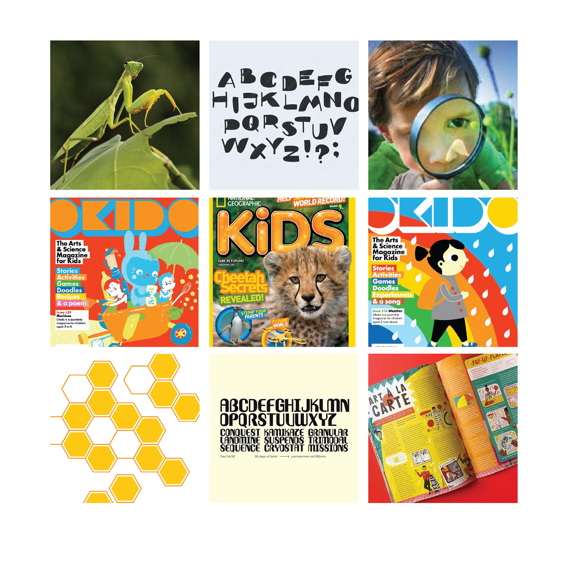
Inspiration
Bright bold colors, playful and inviting. A sense of organization through strong shapes.
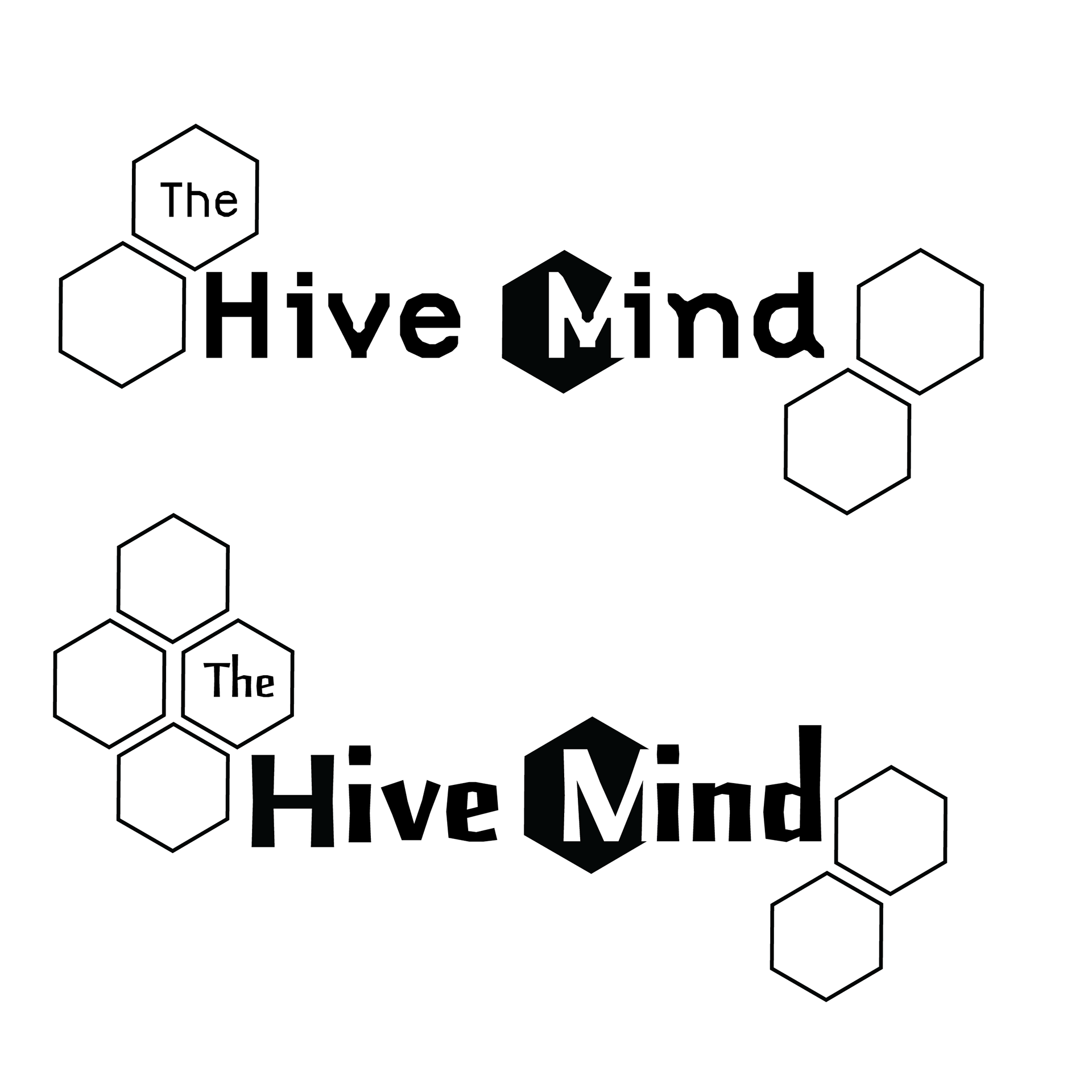
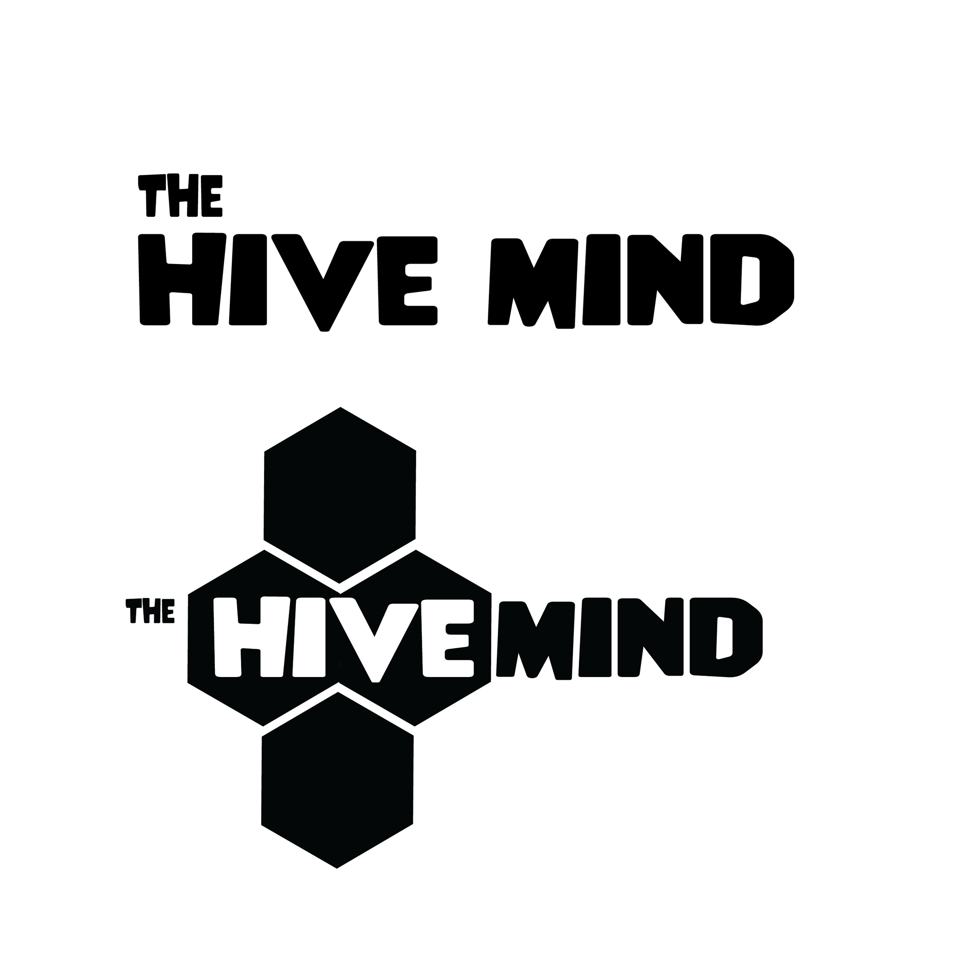
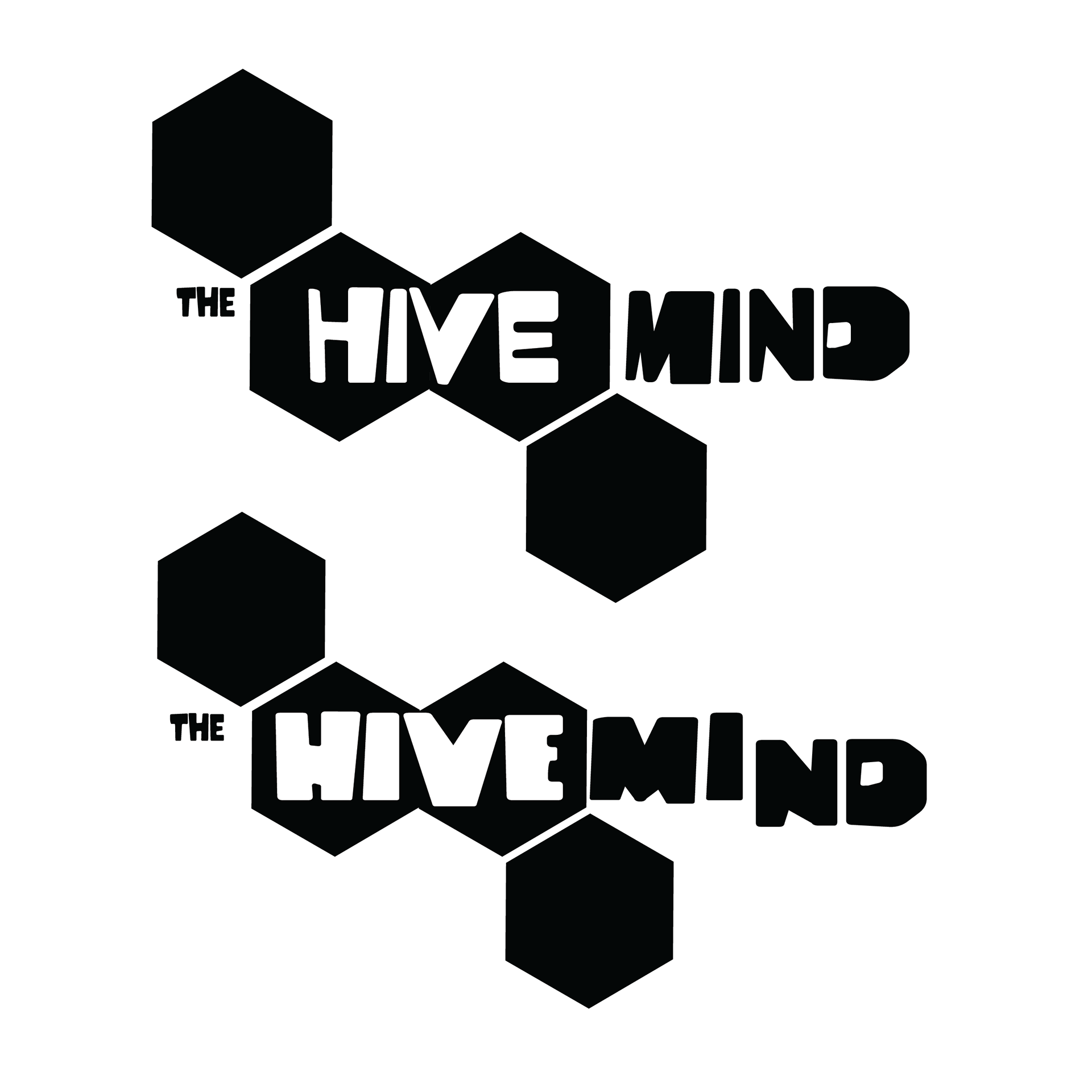
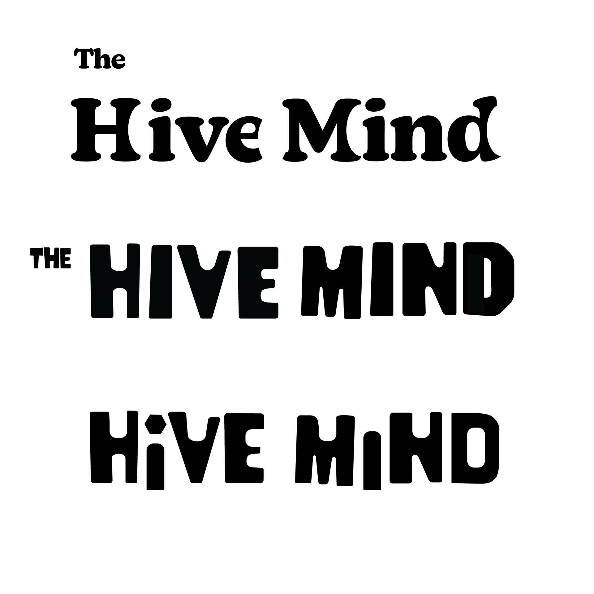
Wordmark Process
Integrate shape into the letterforms for a playful yet scientific look. A careful balance between childish and educational.
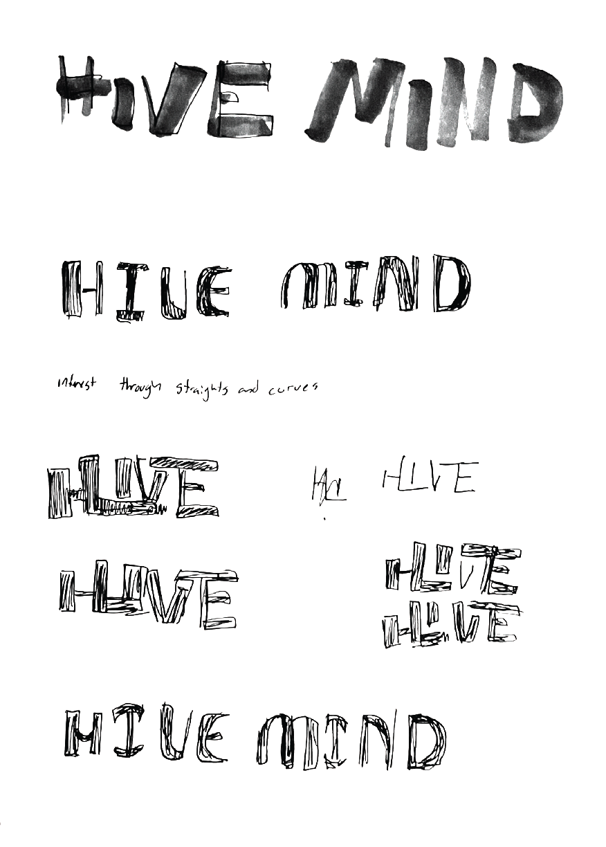
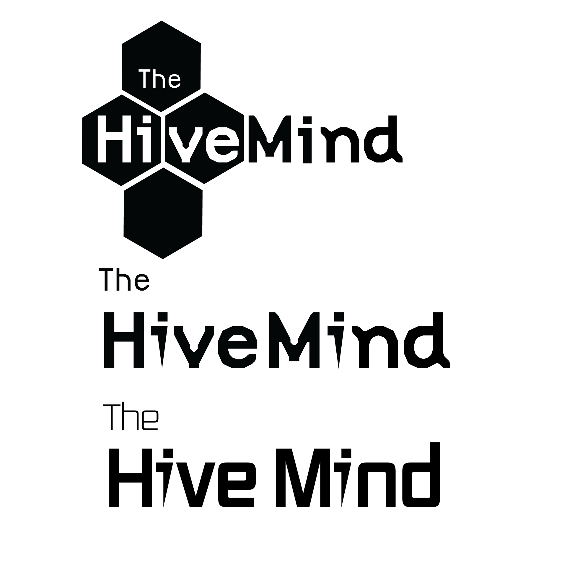
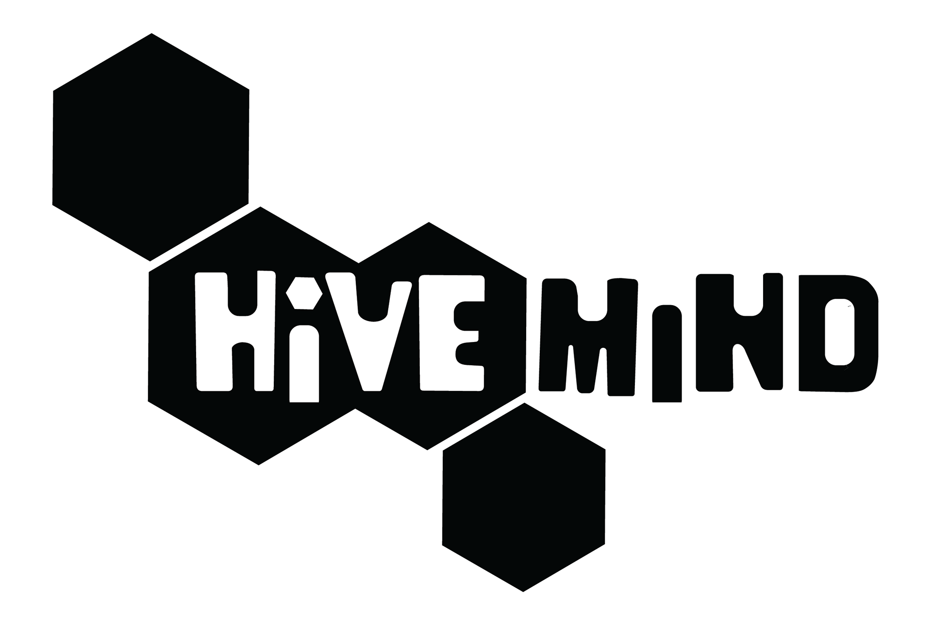
Final Wordmark
Decided on a blocky font to achieve an inviting look. Altered the width of the letterforms for a controlled chaos, a sense of childishness. Integrated the honeycomb shape for that scientific feel.
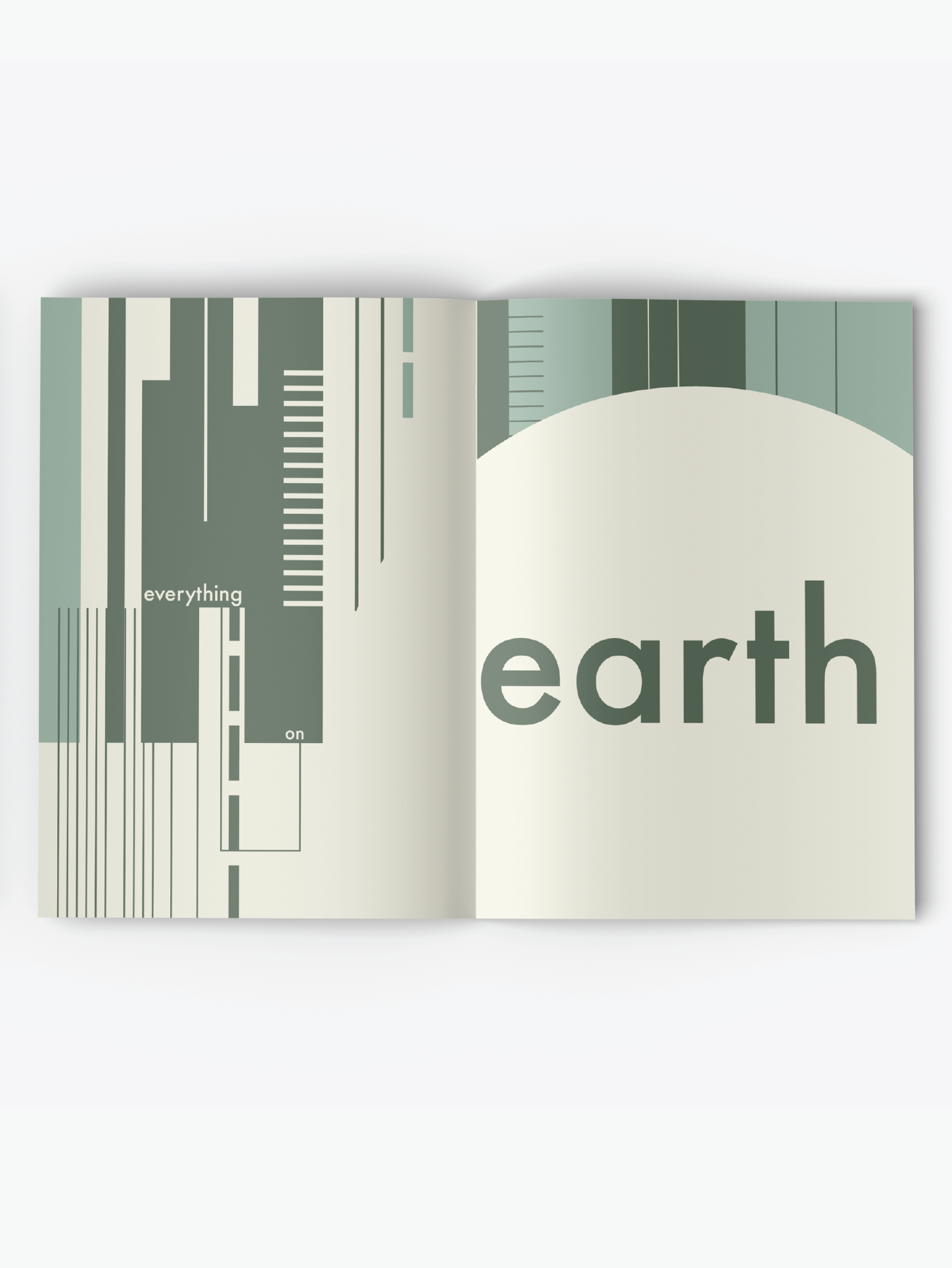
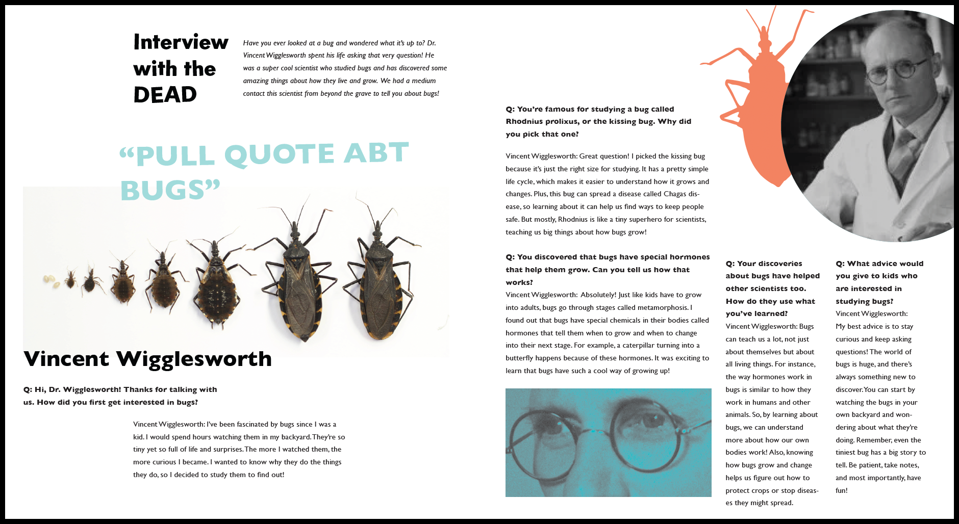
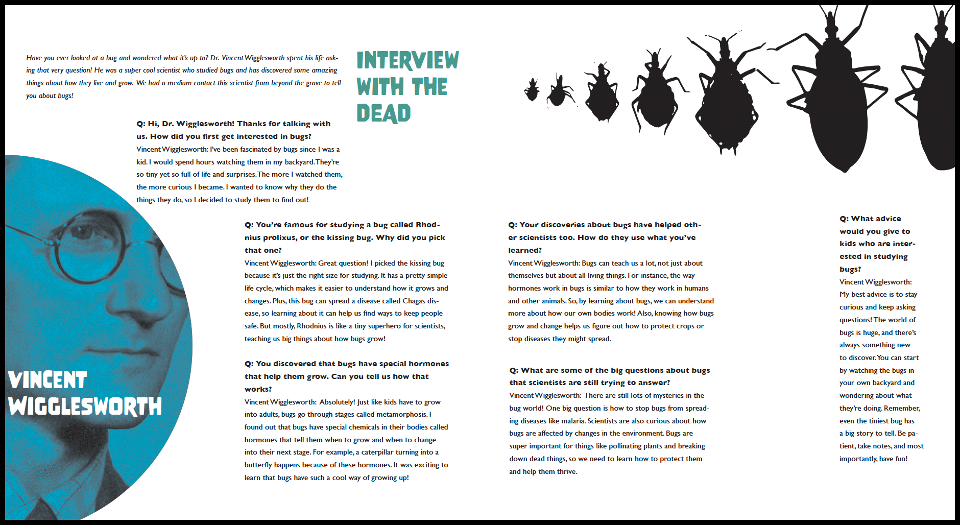
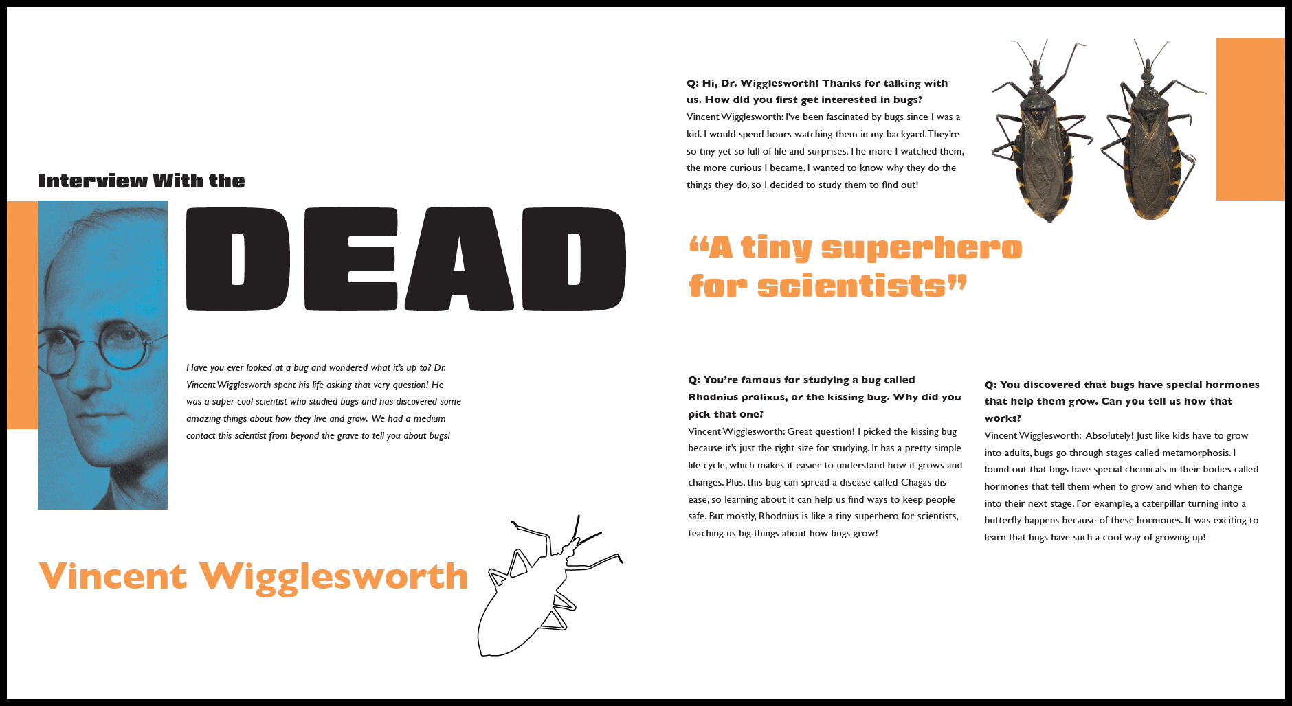
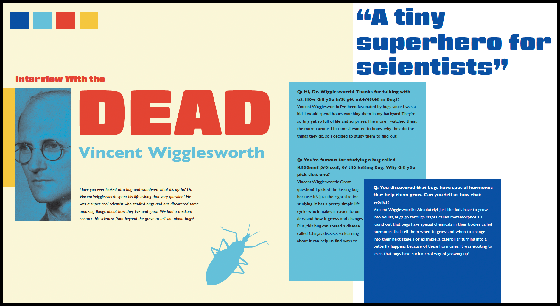
First Spread Process
Used the first spread to define the system. Explored shape and typography to achieve the best visual flow.
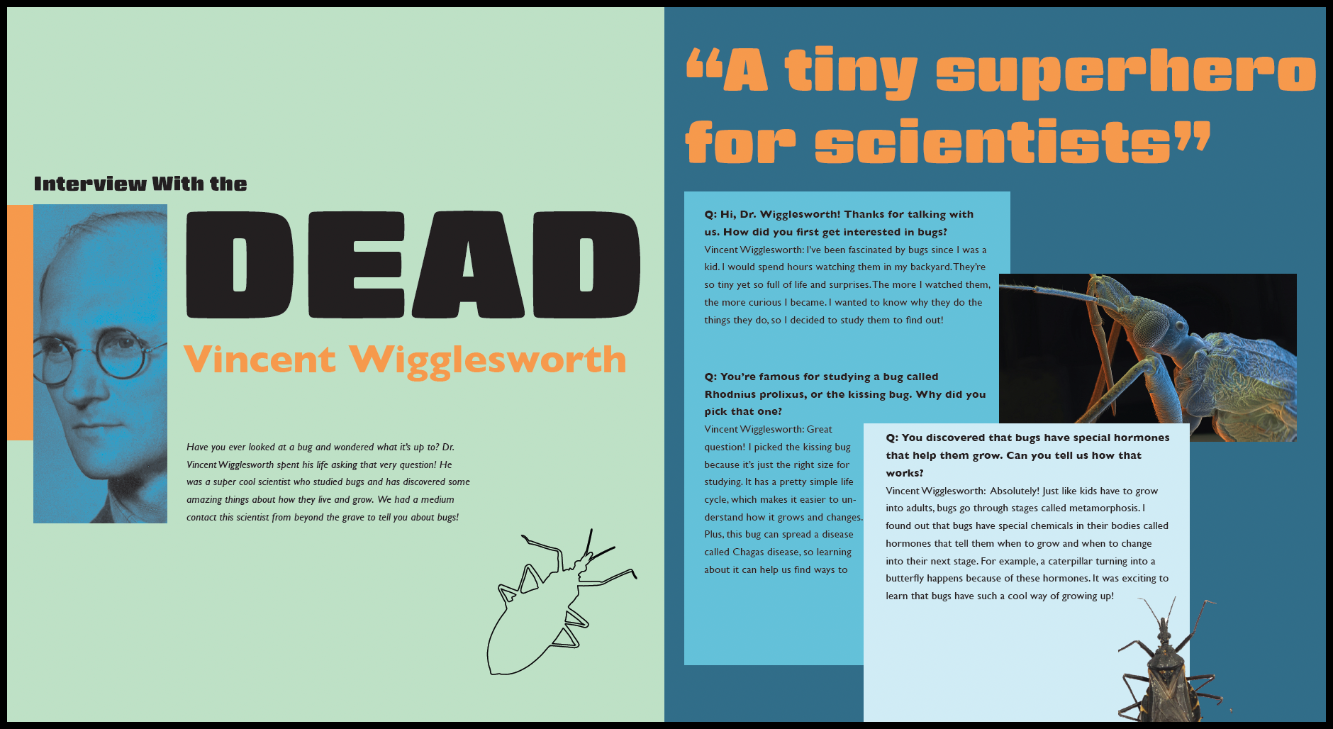
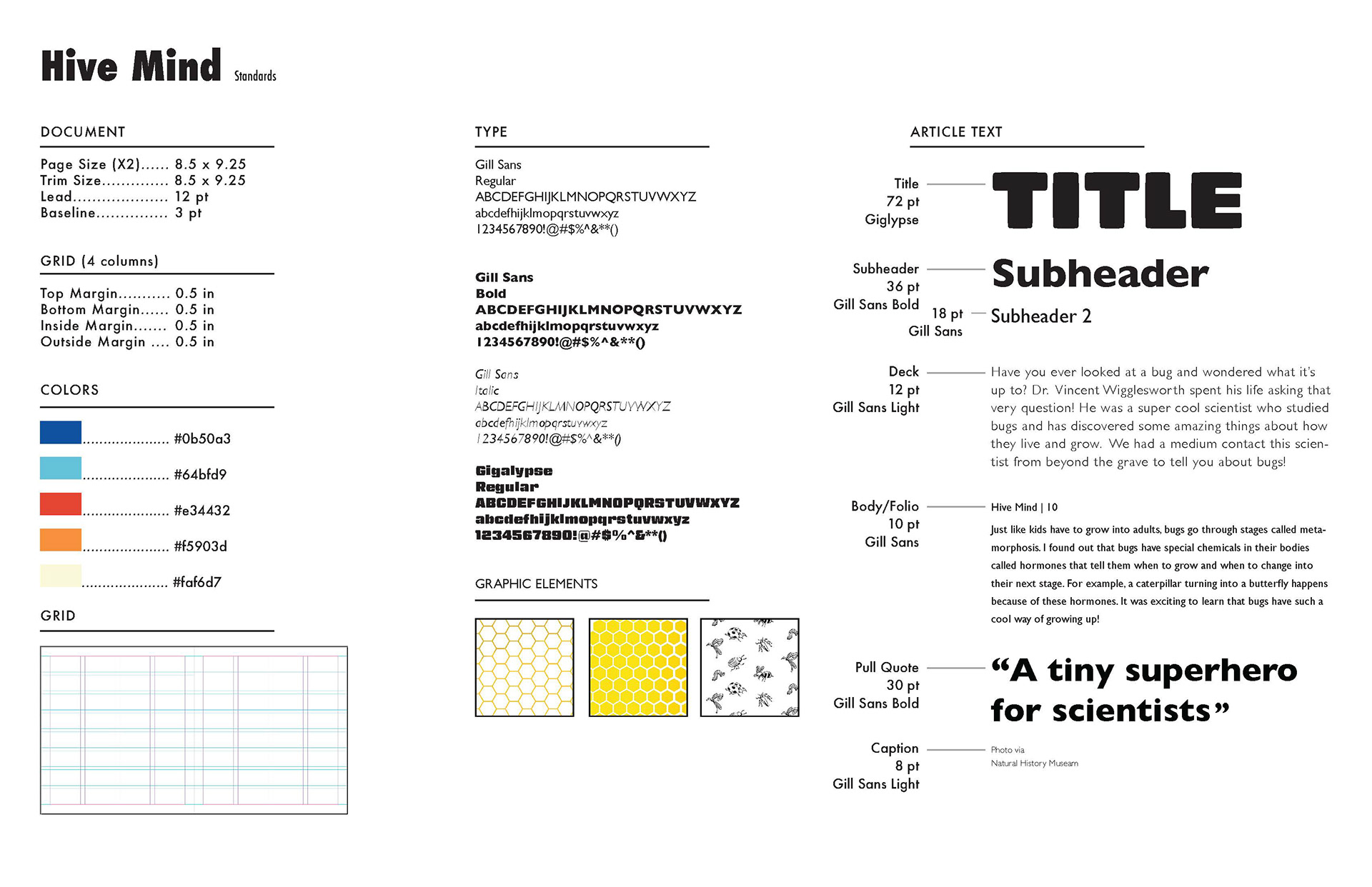
Standard Sheet
Defined my standards through exploration of colors, layouts, and fonts. Decided what would achieve the inviting and playful look to apply to the rest of the pages.
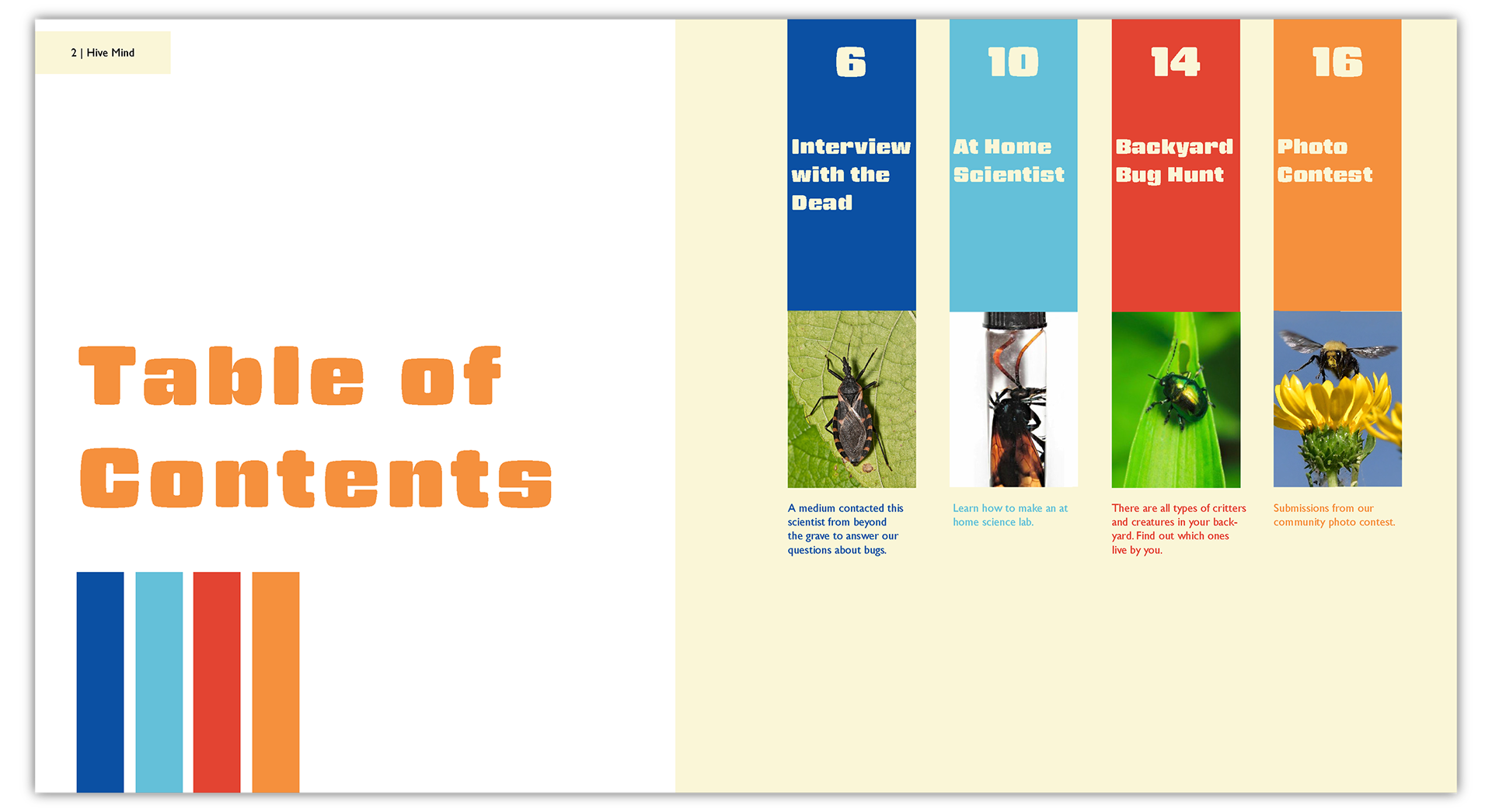
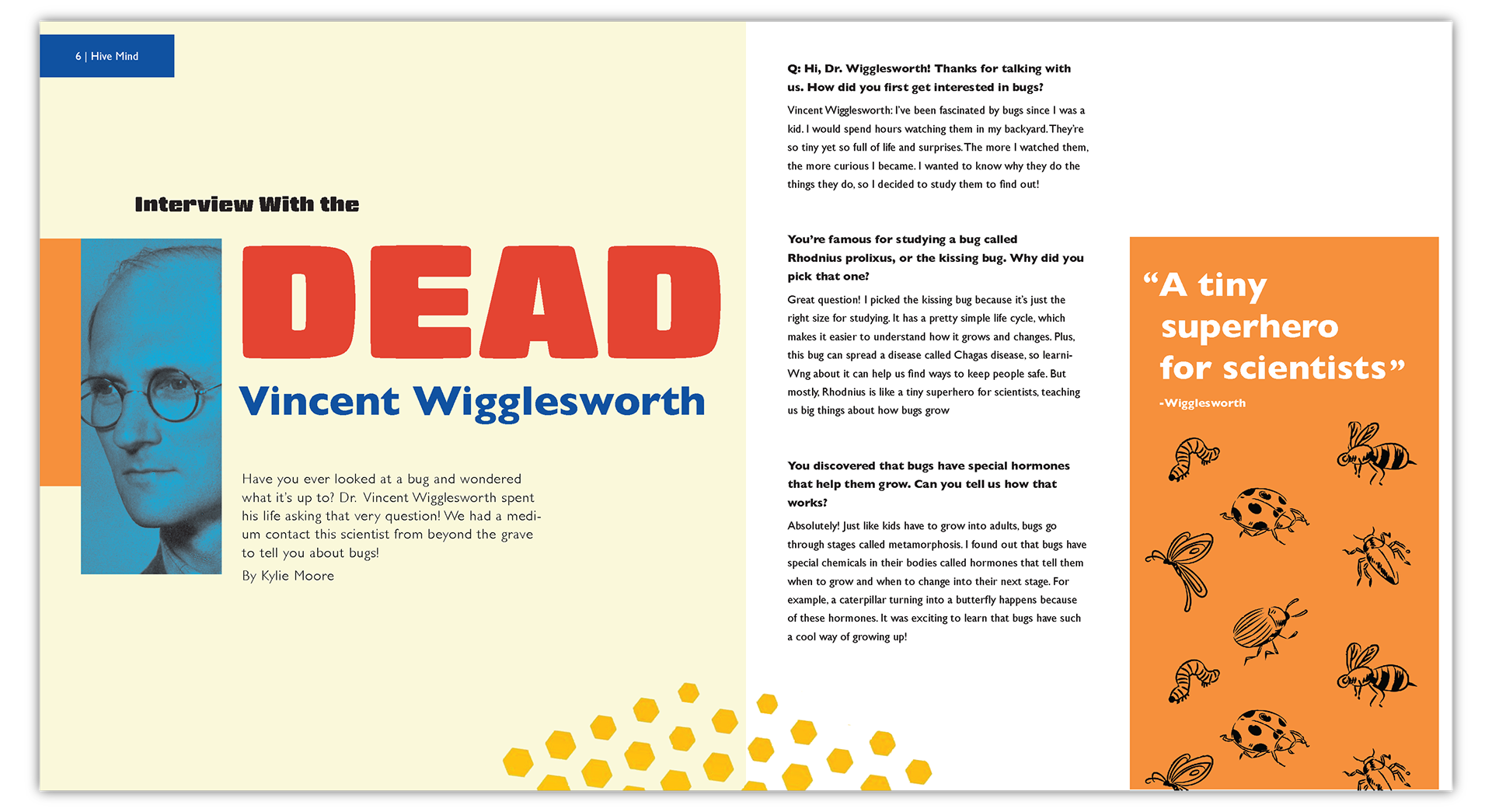
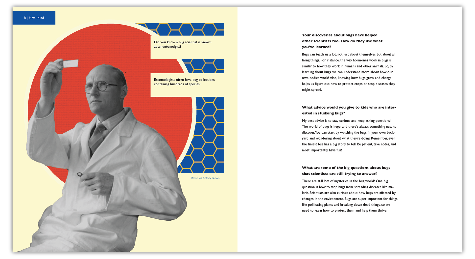
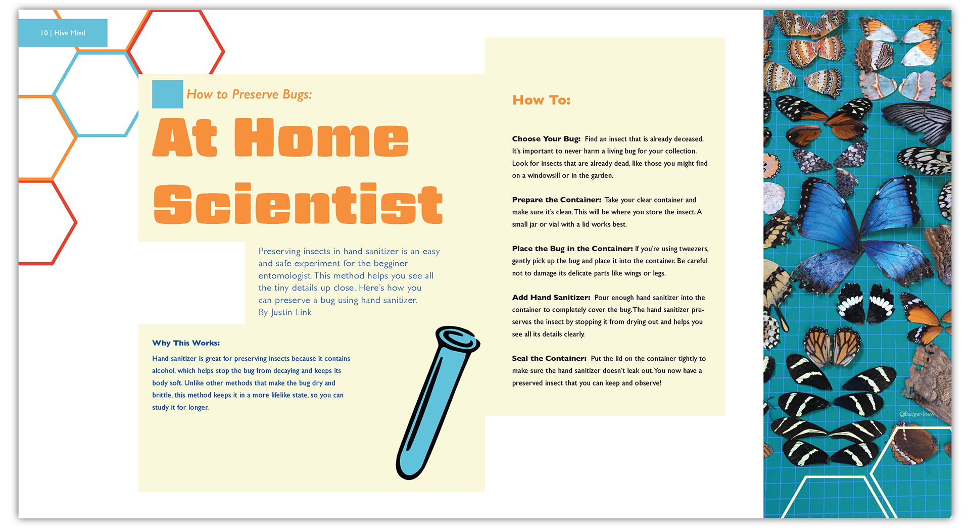
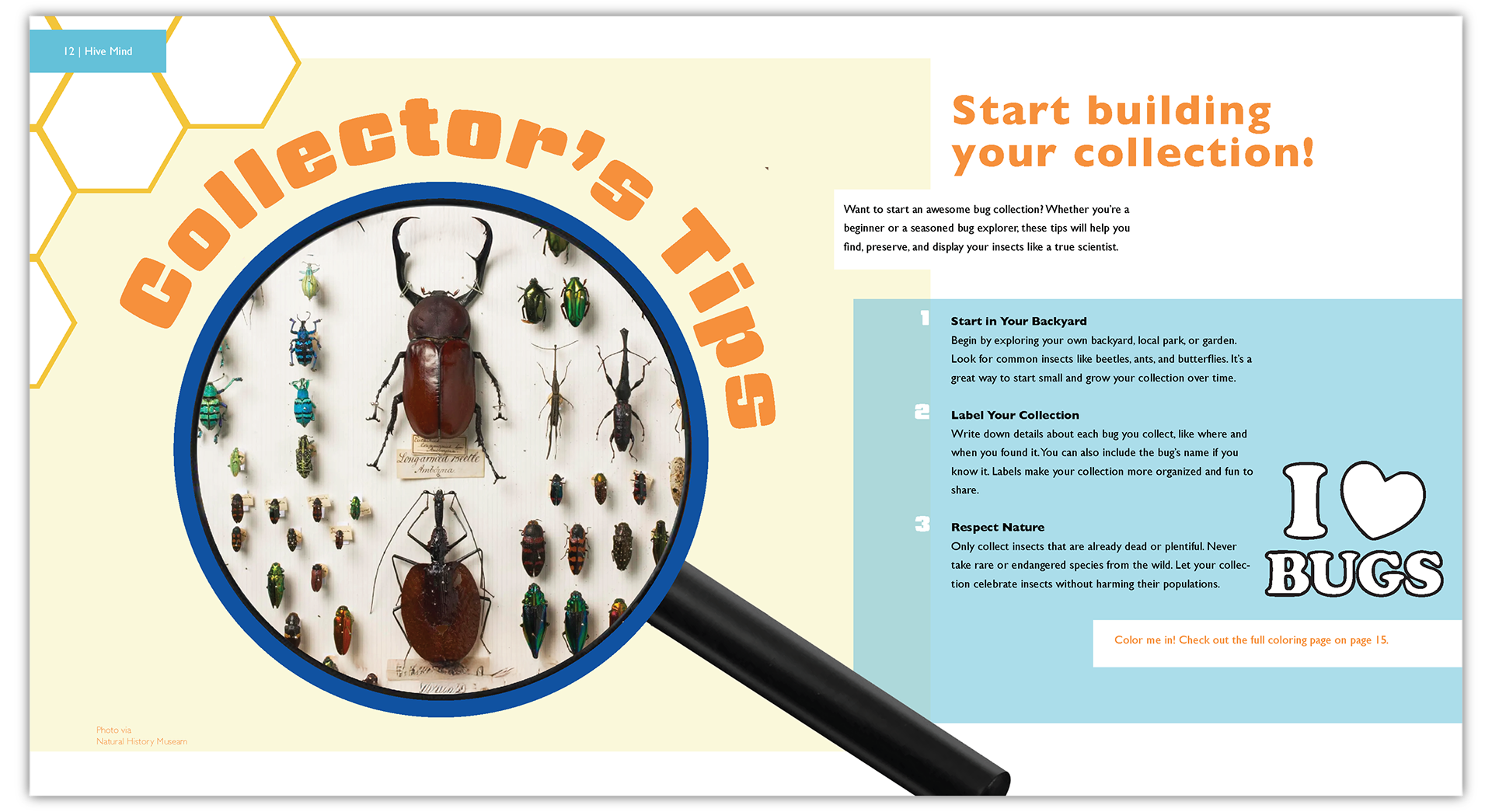
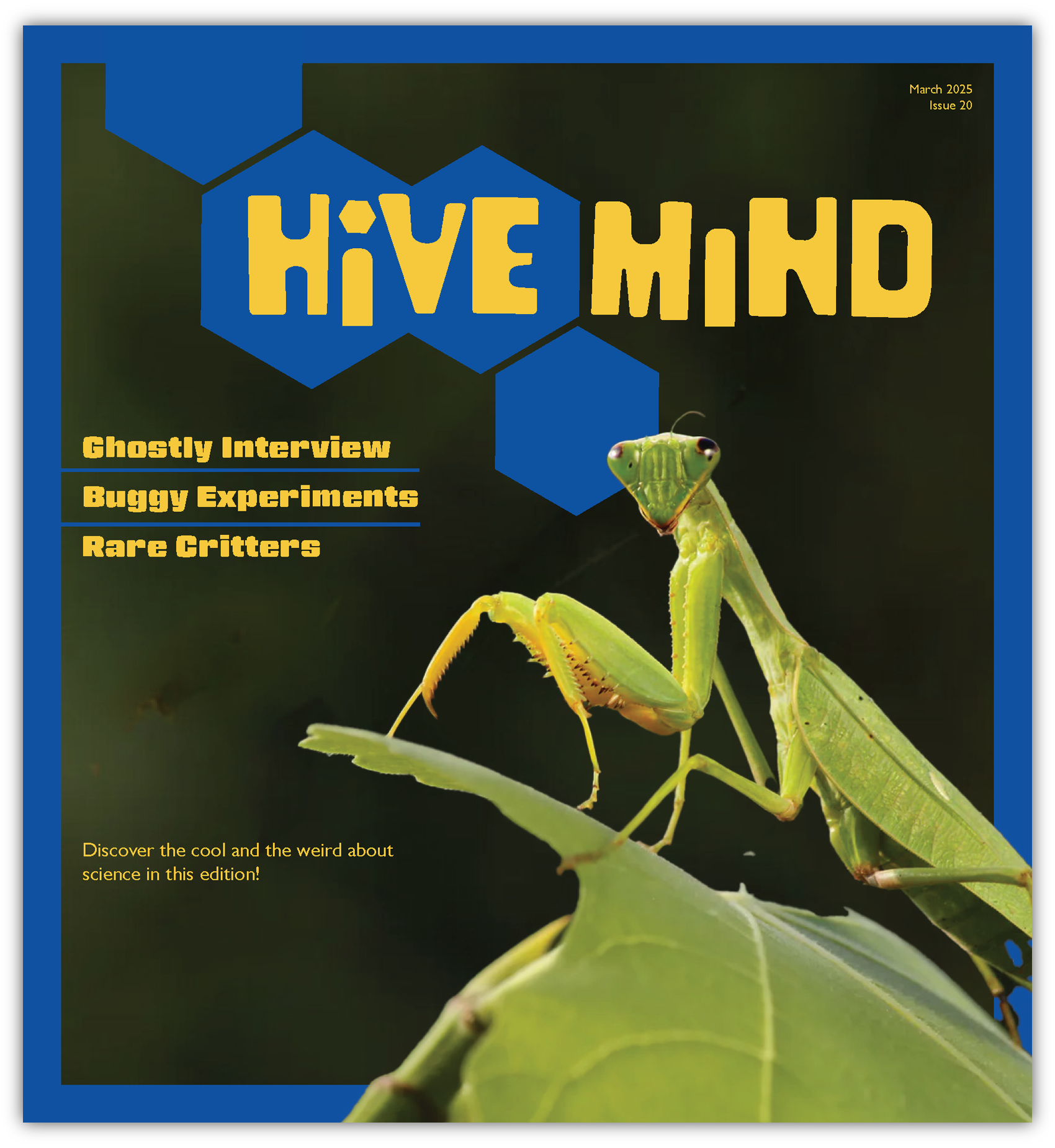
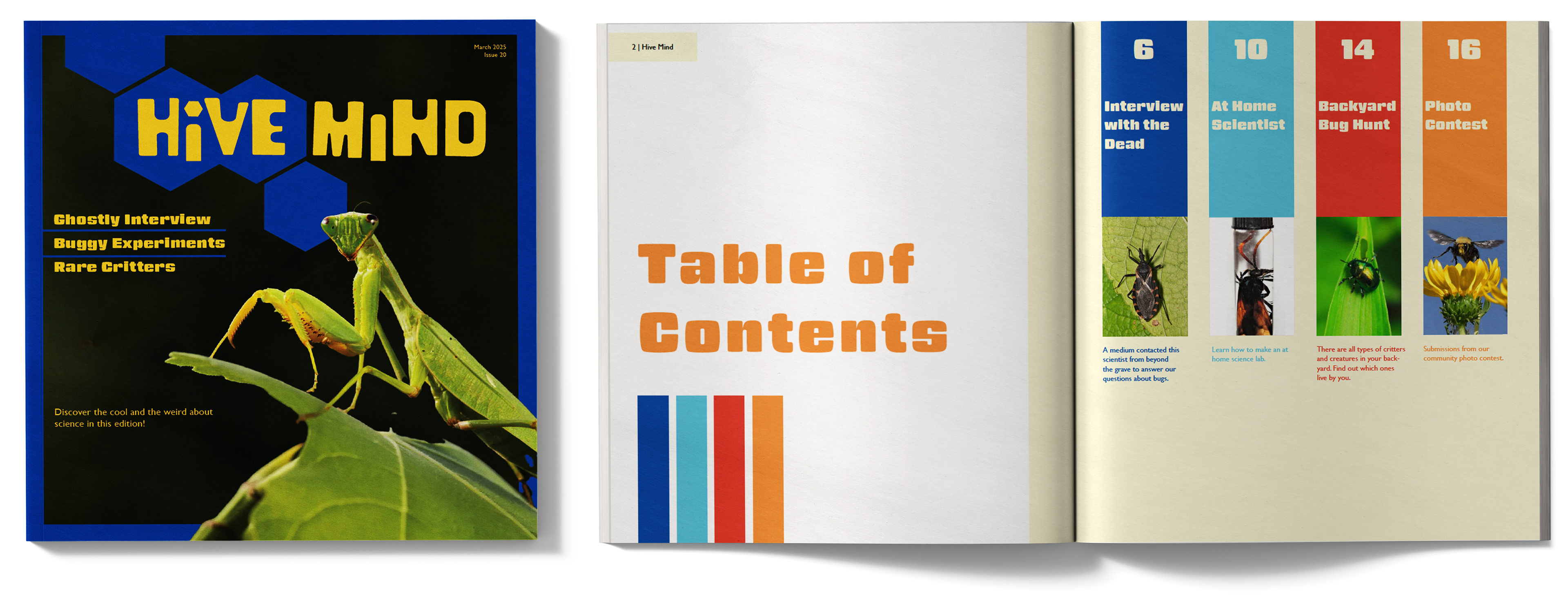
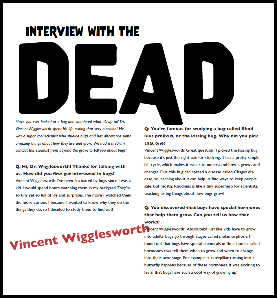
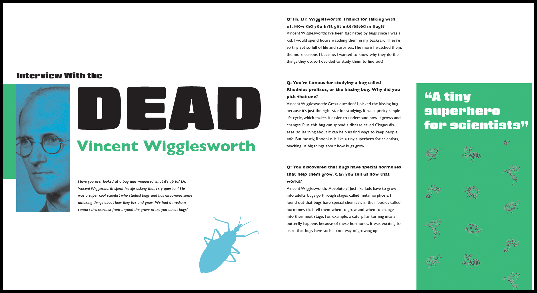
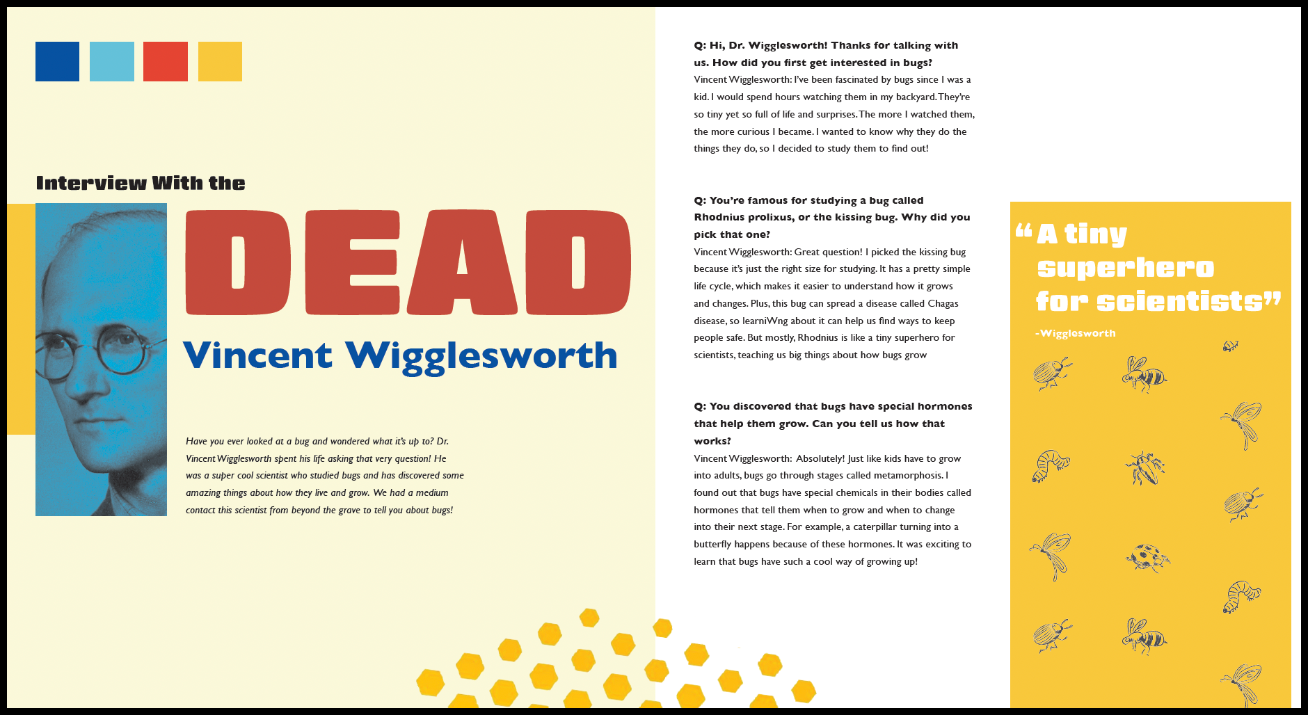
Final Magazine
Utilized the system created to design a total of 5 spreads and a cover. The young audience was the focus of the design process. Kept the movement of the page exciting. (ask which display is better).